

Use of Gradient Colors in the Confectionery Industry
Colors are never as simple as we make them out to be. For every color, a million different pantones go along with it. Then there are color gradients. Who knew there was so much to know about colors? Color gradients involve a gradual blend between one color and another. Instead of one color stopping abruptly and another one starting, gradient allows for a seamless transition between the two. In the business world, there are plenty of industries that might benefit from including gradients in their packaging or brand colors. Today, let’s break down the use of gradients and why the confectionery industry is a perfect fit for using them.

A color gradient isn’t defined by two specific colors. In fact, there are practically endless color combinations that can form gradient looks. A gradient can come in the form of a darker shade or a lively bright shade. Therefore, the emotions and meanings that come out of each will differ. However, one thing we know for sure is that it simultaneously represents current and old times. How is this possible? Well, gradients are a trending aesthetic that more and more people are incorporating into their day to day activities. For example, one of the most successful social media platforms, Instagram, uses a gradient logo to represent their brand. That’s about as relevant as it gets right there. However, gradient color combinations have been around for years, such as the Firefox logo that started in 2004. From this, color gradients can bring out a sense of nostalgia and rejuvenation at the same time.

|
Types of Color Gradients
There are several routes to take when deciding on what color gradient is best for your business. Different types of gradient combinations might include a monochromatic color scheme, a complementary color scheme, and more. Monochromatic gradients involve different shades of the same color that blend into one another. On the other hand, complementary gradient color schemes take two complete opposite colors and blends them together. Depending on how much you want your packaging to contrast, you always have the option to decide which color shades should go together.
 |
 |
Confectionery Industry
You would think that the industry that uses color gradient logos the most is the confectionery industry, right? Well, sort of. In terms of globally known brands, there’s a few companies that we all know and love who incorporate gradient into their packaging. Brands such as Godiva, Sour Patch Kids, and Warheads all use a distinct blend of colors that make for a colorful and smooth appearance on their packaging. Lifesavers Gummies also have certain collision packaging that incorporates a few color blends, but it still generally changes colors abruptly rather than using a gradual transition. When you analyze the colors that popular candy brands use, you’ll notice that they often choose colors that match the flavor and/or look of the candy.
Breaking it down:

|
|
 |
|
 |
|
So, matching your color gradient with your product is never a bad idea! It’s no secret that the confectionery industry always emphasizes the use of multiple colors in their products and packaging. So, perhaps it’s time to keep up with the trends and include colorful brand colors by choosing color gradients.
Popular Gradient Combinations

Our cotton candy pink gradient bag is a great option to choose for your sweet desserts. This bag is 100% food-safe, reusable, and gives off a perfect jovial aesthetic.
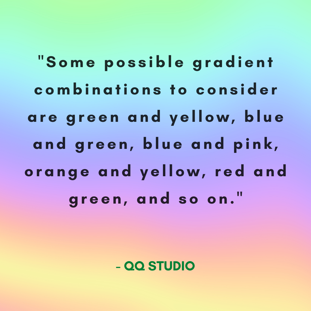
In the confectionery industry, it’s probably best to choose light-hearted bright packaging that will appeal to a younger demographic as well. Some possible gradient combinations to consider are green and yellow, blue and green, blue and pink, orange and yellow, red and green, and so on. If you’re interested in reading our gated color blogs, create an account to find out what each individual color means. This way, you might get a better idea of what combination works best for your business. Also, don’t forget to keep the flavor and color of your product in mind when choosing packaging!
Overall
We hope you were able to learn something new about color gradient combinations and why it might benefit your confectionery business to use them. Matching your colorful goodies with colorful gradient packaging that invokes modernity and nostalgia at once could make all the difference. We have other informative color blogs as well. If you like this blog, check out our other one on why holographic is the most modern color.
QQ-Tip: Pay close attention to packaging trends that stick. If something is constantly coming back in style, it’s a safe bet that your business could utilize it for a better appeal.
0 comments