Why Silver and Gold is Popular in Packaging

As a business owner, it is important to examine packaging used around your industry, and consider why it looks the way it does. Colors and patterns are constantly being used by brands to represent themselves. Silver and gold colors are no exception to the list. These two colors are some of the most popular packaging colors in the world. Sometimes, people might overlook the possibilities of what associating silver and gold with a brand’s packaging might mean. We’re here to give you the scoop on the history of both colors, how they add to the packaging of contents stored inside, and help you determine if you need it for your business.


Silver first started to be mined around the year 3000 B.C. Silver coins derived from Greece, dating back to about 400 B.C. On the other hand, gold may have been discovered as far back as 40,000 B.C., while gold mining didn’t take place until 3600 B.C. by Egyptians. The Egyptians didn’t seek out gold for value. Rather, they sought for gold because of its visual aesthetic. Also, the Egyptians viewed gold as a form of spirituality, in which it represented infinite life, power, and other religious meanings. Many powerful figures (both men and women) wore gold and made sure it was kept in their tomb after they died. Over time, the value of gold became more prevalent. More countries such as Greece and Italy began searching for it and developing its worth and usage.
In the 20th century, the California gold rush was one of the most significant periods. After the discovery of gold at Sutter’s Mill on the bottom of the Sierra Nevada Mountains, everyone jumped on the opportunity to find a large amount of gold themselves and subsequently increase their wealth. Thousands of people from all over the country flocked to California in hopes of mining gold. Everybody knew that the value of gold was held to a high standard, and this perception of the color became solidified.

|
 |
Both silver and gold hold some weight to their name, literally. Many times when we think of the two, we think of metal. There is usually some type of monetary value attached to both names. Daily, people buy and sell gold and/or silver. The values of these metals fluctuate per day. As a result, people often try to purchase gold and silver at a lower price and sell when the profit is high. Because money is a direct association to these colors, businesses might use it to their advantage in packaging so it displays their products as valuable.

The Olympic Games is an event held every year that emphasizes the meaning of gold and silver. Typically, gold represents coming in first place, and silver means taking second. These colors are one of the few that translate to the meaning of high ranking. Somebody receiving a gold medal at an event is considered an honor, milestone, and a valuable accomplishment. If we are going by these standards, silver is technically a lesser value than gold, which is also reflected in comparing the monetary value of each metal. However, silver is still regarded as a high grade color that makes a statement of high status.

|
 |
Typically, the championship trophies for most sports consist of silver or gold material. For example, baseball uses a traditional trophy every year that utilizes silver and gold to express success, value, and high-class. This directly relates to the usage of pinstripes in baseball too. Classic designs become a symbol of important status and something that others admire from a distance. As time progresses and more people associate themselves with elegant designs such as pinstripes, gold, and silver, the larger than life portrayal of the material becomes even more emphasized.


The appearance of silver typically has a reflective greyish shade to it. Silver is considered a neutral color that can match just about anything. For this reason, the color is used much more daily as opposed to other colors such as orange that doesn’t match many colors. In the marketing world, we understand that the more visible something is, the more recognizable it becomes. Silver has a reflective shine that helps it stand out amongst other colors. Without the shine, silver has an all grey look that can sometimes be mistaken for the actual color. You can notice the difference when comparing our matte silver and gold bags with these glossy silver and gold bags. The reflectiveness in the matte is way more subtle, showcasing a different shade of both colors.

On the other hand, gold contains an elegant yellow-like appearance. Gold tends to stand out a bit more because of its tone. Similar to silver, the shiny element in it makes gold look a bit more elegant than other solid colors. However, there are different variations to gold that should be kept in mind. A non-metallic shine form of gold will almost carry a completely yellow tone to it. Some believe that gold looks better on warmer skin tones, while silver can complement pale skin tones.
Due to jewelry being more expensive depending on the weight and authenticity of the gold and silver used, we think of wealth when we look at bulk amounts of either color. Many times, people buy items that they know aren’t pure silver or gold, but look the part to appear fancier. Fake silver and gold have flooded society just as much as the real thing. The colors alone have become just as visually valuable as the metal. Even if what your business is selling isn’t necessarily an expensive item, the gold or silver packaging color will eliminate the idea of your product being cheap. Without proper presentation, a business selling cheap products will have a more likely chance of being labeled as tacky. Your business should always avoid this type of reputation because people will find less worth in your brand.


Both colors are highly complementary to so many clothing outfits and products. Gold and silver jewelry are some of the most common accessories worn to upgrade a look. Businesses might use the colors in the same way. By incorporating silver and gold into the image of their products or brand, the presentation of what they sell will therefore be shown in a better light. Silver and gold are commonly used as wedding gifts or for streetwear. Kay Jeweler is an example of a business that specializes in selling jewelry that might cater to both. Oftentimes high profile social media personalities such as musicians will wear gold and silver chains, leading to a collective of fans wanting to do the same. Rappers are known for doing this frequently to maintain a lavish persona.

We see gold and silver packaging in most industries. The beauty industry especially uses both colors pretty frequently. Brands such as Sephora, L’oreal, and SeeMe Beauty all incorporate gold and silver into their packaging. The idea that beauty predominantly uses these colors is an indication that gold and silver are a symbol of beauty as well. The industry gravitates to the selling point that their products are just as glamorous as the color packaging. YSL lipstick and handbags also use silver and gold packaging for their products. This brand has a reputation for being a high quality company, which is why it makes sense to maintain a consistent quality look from their products to packaging.

|
 |
At one point or another, some have considered “mixing metals” to be a major rule breaker in the fashion world. However, now there seems to be some kind of change, where people are starting to wear both silver and gold together. For this reason, it’s not a bad idea to pair gold and silver together in your business product lines. Since many people buy both, there really isn’t a chance that one color will cannibalize the other.


In food packaging, products are often stored in an aluminum or metallic film material. Sometimes the outside display of the bag will keep this look to resemble the silver coloring of the material. Of course, tradition is always a factor in why packaging remains the way it is. Silver, more so than gold, has made a regular presence in food packaging for quite a long time. Tinfoil is a common food preserving wrap that covers food with a lustrous tone. A great example of a brand using silver packaging is Klondike. The Klondike bar wrapper has been consistently silver forever.

Since Klondike is a cold freezer product, it also raises a question about the color silver being tied in with cool items. In the beverage industry, you might notice that brands such as Coors Lite offer silver packaging that incorporates snowy mountains into their image. Perhaps the light reflective coloring portrays silver in a winterous fashion. Many times we see diet soda companies package their products in silver as well. Perhaps because diet is considered a “light” version of regular soda, the companies use silver to represent that it is 2nd to the real thing yet still quality.

Gold does play a role in the confectionery industry though. Specifically, many chocolate brands such as Godiva and Ghirardelli have adopted the gold color packaging look. Perhaps because chocolate is arguably the most popular sweet flavor, the color gold sends a message that the product is “number 1” in desserts. The golden standard of chocolate is one that I certainly believe in! Garibo gummy bears also display their product in gold packaging to make a visual statement that they are the best brand. If your business sells confectionery food items, I recommend utilizing gold in the way that most of your competition does.
High-end restaurants sometimes offer edible gold on food. This is a food-safe gold that makes a dish look fancy and dazzling. Typically, the cost of food covered in gold is extremely expensive, and takes the worth of regular food to another level!

|
 |
 |
Our Brand
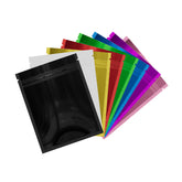
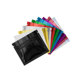
QQ studio is constantly keeping up with the latest trends and business patterns. As a result, we regularly look to incorporate colors and designs into our already versatile catalog of packaging bags. Gold and silver have remained a consistent color option for our bag models because of their popular demand in the packaging industry. We offer a large variety of bags in multiple color and sizing options. For packaging, you might like this double-sided silver bag. This QuickQlick™ bag is food safe, resealable, and reusable. The bottom gusset feature will allow you to position the bag upright on any shelf display. For gold packaging, check out this metallic film flat bag. This bag is excellent for maximizing storage space and can also be reused! Your business should be looking to expand your packaging selection in the same way. Even if the gold and silver colors don’t match your brand coloring, the immediate impression of your product would be positive. Also, having diverse color packaging options will help you differentiate the products you sell.

Furthermore, our brand offers special custom printing for any business. From this, your business can put any customized logo on our packaging bags. You may also want to consider whether to put a silver or gold logo over a different color bag, or vice versa. There is no wrong answer in either choice because you are still utilizing gold and silver to make your product more valuable in appearance.
Wrapping Up
Don’t hesitate to incorporate silver and gold packaging into your business if you feel it’s right for you. With the number of industries that use it and global popularity gold and silver has, it’s hard to go wrong with these colors. We’re going to continue to give you all the information you need about colors for your business. If you like this blog, check out our other blog on pinstripes in sports. The timeless feel of some colors will probably never go away!


