How to Use Green Packaging to Appeal to an Eco-Conscious Demographic
How to Use Green Packaging to Appeal to an Eco-Conscious Demographic
What does it mean to be green? If you were to say “I want to be greener”, this would have different meaning based on the point in time you said it. At one point people may interpret that to mean you wish you were sicker. Or, they may have thought you wanted more money. A select number may have thought you literally wished your skin was greener. But today, the word is widely understood to stand for environmental conservation. To be green is to be aware of your environmental impact, and to take actions to reduce it. Companies can use these pre-conceived notions about the color to appeal to a customer base that shares these values.
Green Branding

Knowing that green is the color of nature and the organic world, the next question is how you can make green work for your brand. If your company is going to strive to have a low environmental impact, then utilizing green would be a good way to highlight this. However, you can still use it if you’re apathetic towards the environment. Green still has positive effects that make it a great branding choice, like an association with freshness. Our prehistoric familiarity with green also make it friendly and welcoming to most customers. Studies have shown that consumers find green in branding to mean young and playful. It represents new beginnings or growth. It is generally associated with nature, growth and money. Capture this same magic with our green QuickQlick™ bags.
Whole Foods

Whole foods is the hippy supermarket your college professor probably shopped at. The supermarket is famous for its fresh ingredients, organic produce, and environmentalism. Whole Foods sacked plastic bags in 2007, far earlier than most stores. They use paper bags, or specially made biodegradable plastic bags. But expect some dirty looks if you go into a Whole foods without your reusable tote bag. As far as logo design goes, whole foods keeps it simple. They use a Pantone 342 C green circle, with their store name in the center. Not much else, aside from a leaf on the “o” of whole to make it look like an apple, or some kind of fruit. The image that they are trying to create is obvious. Natural, organic, and fresh. The darker shade of green they use makes the logo appear more natural. It more closely captures the color green seen in nature. This aesthetic and their commitment to natural products is what compels the eco-conscious customers to go there and shop. It is most certainly not their prices. Customers that strive to find green alternatives to their grocery shopping are willing to spend more to get organic and eco-friendly products.
BP

One company that is trying to project the air of greenness while doing the exact opposite is BP. British Petroleum is one of the world’s largest oil and gasoline suppliers. Following the rebranding in 2000, BP added the tagline “Beyond Petroleum” to symbolize their plans to reduce the carbon footprint of the company and work on more green energy solutions. The problem? The average person is not nearly as stupid as they assumed. Most people saw through the thinly vialed attempt, and recognized the contradiction between promoting eco friendliness and drilling for oil. This was not at all helped by the Deepwater Horizon oil spill in 2010, during which 210 million gallons of oil was spilled into the Gulf of Mexico. Still, BP is sticking to its branding strategy. Despite a net loss of 65 billion from the spill, they are still around and pumping. You can take BP’s horrible rebranding as an example of what not to do. Using colors that completely go against your brand image will not have positive effects. Imagine if QQ Studio, a brand that specializes in colorful packaging, had a black and white logo. It wouldn’t make sense.
QQ Studio

Hey, that’s us. You may have noticed that QQ Studio uses a combination of green and blue for our branding. What made us pick these colors? Green and blue is a representation of the sky, sea and land. This is a direct reflection of how QQ Studio encompasses all colors in the spectrum that can be seen between the sky and the sea. Blue and green represent the earth, and since we provide all the colors on Earth, it was a fitting choice. The blue and green also generate a calming effect, which makes it easier for businesses to make a decision and build trust with our brand. The green also symbolizes growth. We aim to help businesses grow their company and make money, which is also green. How’s that for an answer?
The combination of green and blue together creates a different effect than the two colors on their own. At QQ Studio, we understand how colors work with each other. If you look at our packaging boxes, you can see that one part is green and the other is blue. We did this to make the boxes distinct, and enjoyable to look at. You can pair green with blue to represent earth, or you can pair it with red to represent Christmas.
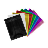
You can find examples of packaging bags that draw off these tenants in our green collection. These packages were inspired by the same natural and organic ideas that companies like Starbucks are trying to encapsulate. Take a look at our Forest Green QuickQlick™ pouches for an example of a bag that evokes a fresh and creative feeling in the customer. These Forest green pouches are excellent for storing craft supplies because of the youthful coloring.

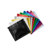
If you are packaging food, consider our Half Emerald Green QuickQlick™ pouches. The translucent window lets the stored food inside the bags be seen by the customers so that they know exactly what they are buying. The matte green on the bag will assure the customer that the food is organic and fresh, thanks to the connotations we discussed earlier.
Want to Know More?
When you create an account on qq-studio.com, you will gain access to our exclusive, in depth analysis of the meaning behind the color green. This guide will show how the color became associated with the environment, and it will go into more details about how different brands are using green. Create an account now to learn more.


