The Best Shades of Yellow for Packaging

Best Shades of Yellow for Packaging
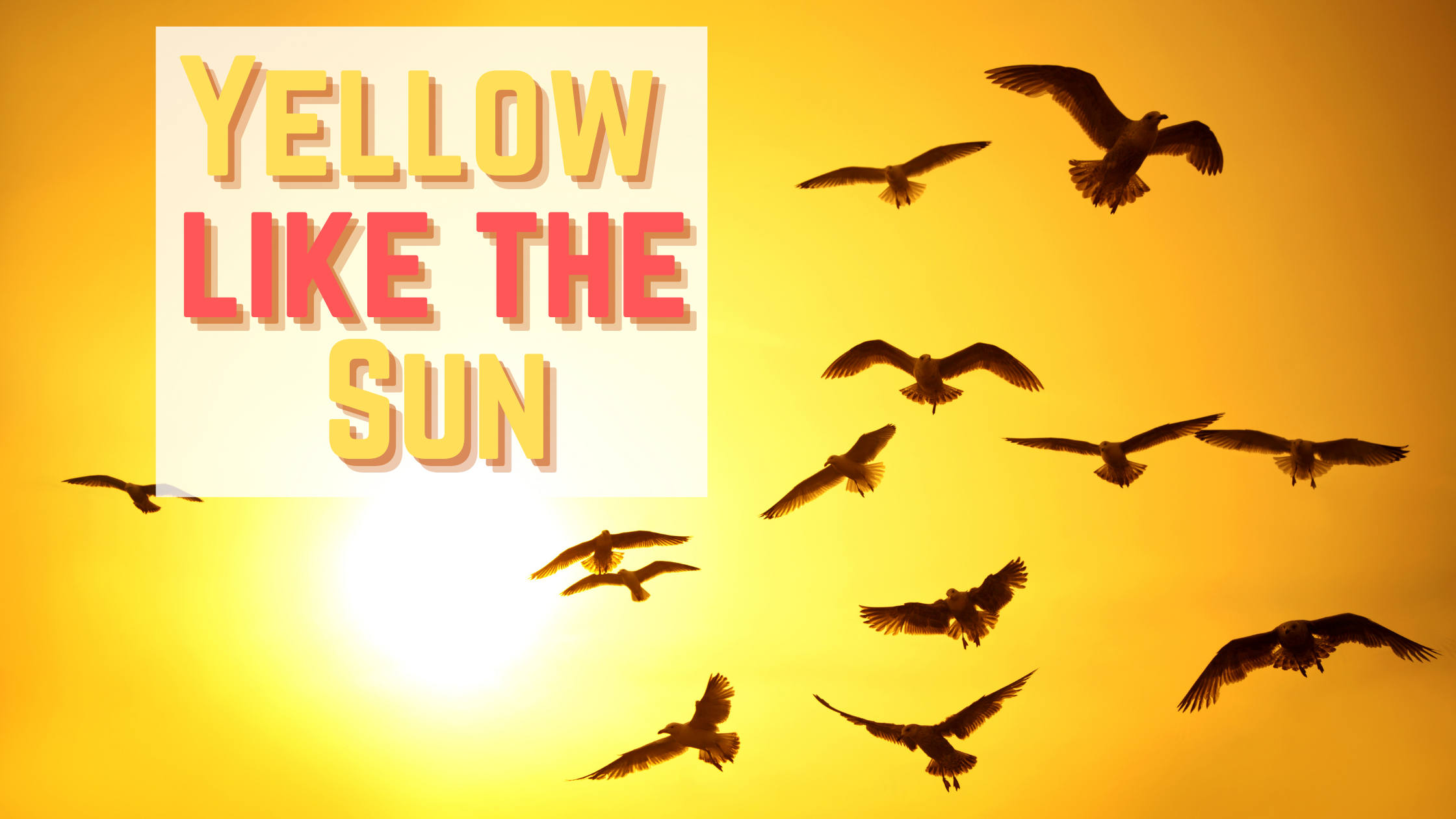
Yellow is a difficult color to utilize. When you ask an average person their favorite color, the chances that they say yellow are slim. Yellow is not that popular of a color. It's hard to pull off in fashion, and not used very often in branding. But, this makes yellow worthy of consideration. Yellow may be a risky color to use, but if you pull it off right, and use the right shades of yellow, you can make it work. Your brand can tap into a power that other companies have been too timid to try. Continue reading to learn how yellow can highlight your brand.
Not all shades of yellow will have the same effects on consumers. Yellow is already bright and loud, so using a neon shade of yellow will likely be too much for the average viewer. The brashness of yellow is the leading complaint from people who dislike the color. If yellow is done wrong, it's overbearing and straining to look at for too long. However, when it's softened down and warmed up, it can be pleasing to the eye. Consider a brand like McDonald's, the most popular user of yellow in branding. The golden arches from McDonald's are recognizable on highway billboards and signs, but it's not an eye strain.

McDonald's uses Pantone 123 C, a kind of orangey, golden yellow that emits a happy aura. It is similar in color to our Honey Yellow collection. Adding more red and orange shades to yellow reinforce the warmth of the color and cut down on the neon qualities that put some people off. This effect is why McDonald's pairs its golden arches with red. The two warm colors together create a comforting effect and stimulate hunger. This response is due to red increasing blood flow when viewed. Mickey Dee's has found a way to tap into the biological process of their consumers with just two colors. Yellow is more powerful than you think.

Yellow also has fast connotations. If you look at other brands like Sprint or Ferrari, the yellow used can be connected to speed. Fast food, fast cars, and fast cell service are all attributes represented by yellow. Quick efficiency is a characteristic of yellow brands. Consider Best Buy, Bic, UPS, Shell, or Nikon. All of these brands are using our preconceived notions of yellow to match the message they want to have for their company: fast, reliable, and friendly service.

|
 |
 |
These are great characteristics for the companies seeking customers that are in a hurry or need something fast. The particular shades of yellow that these companies use are brighter and more of a true-yellow than the ones used by McDonald's or other fast-food restaurants. The bright and florescent shade, seen in our Neon Yellow Collection, emphasize the connection between yellow and electricity. While electricity is white, artistic depictions paint it as yellow. Try it, look up the lightning bolt symbol, and see how many results are yellow. People have come to associate the color yellow with power, lightning, and speed.

Consider the positivity of our Honeysuckle Yellow from the Cosmetic Bottle Shape collection. This yellow was designed to pair perfectly with the perfume and cosmetic bottle shape of the bags. It is a unisex color that evokes a sense of balance and enthusiasm in the viewer. Think of frolicking through a field of honeysuckles, the sunlight cascading down through the treetops, a cool wind blowing past, and carrying with it the scent of the flowers. That is the sensation that this shade of yellow attempts to impart onto the observer. Versace uses a similar shade for their Yellow Diamond fragrance line. The light yellow color pairs well with the floral, citron notes of the perfume, and gives the bottle a luxurious appearance.

While you’re browsing different yellows, view our Citrus Yellow pouches that are a part of the Bottom Fill Aluminum and the Aluminum Stand QuickQlick™ collection of packaging bags. These take the zesty appeal of citrus fruits like lemons to generate a vibrant and energetic personality for your products. The bright and friendly exterior makes these bags great to use for candy packaging. These yellow bags, like McDonald's branding, will help your products pop off of shelves. View more of our yellow packaging bags by visiting our yellow collection page. You can see this same citrusy yellow color used in candies like Lemonheads, as well as Juicy Fruit, and Sour Patch Kids. All three of these candies utilize a bright yellow shade to make their products look fun and happy.

|
 |
 |
Want to Know More?
There is much more that can be said about yellow, and bright colors as a whole. To find out more, create an account, and then take a look at our member’s only guides. These analytical resource guides will provide a thorough analysis of the hidden meanings behind different colors. Check out How Bright Colors will affect your Brand to learn all about how bright colors like yellow, orange, and holographic can change the perception of your products.
