


How Bright Colors will Affect Your Brand

If we consider the full spectrum of colors that our eyes are capable of seeing, each has its emotional association. However, these associations are merely the byproduct of our culture and the teachings to which we were subjected. What can be said without exception is that bright colors are inherently more attention-grabbing. It is a simple principle; colors that reflect more light are going to stand out more than colors that absorb it. Color is also the very first thing customers will see when they look at your product. Drawing them in with bright colors is the first step to getting them to purchase.
We will go over three of the brightest and loudest colors that our limited vision is capable of seeing. Yellow, orange, and holographic. Each of these colors has a mix of positive and negative associations that add to their complex makeup. If you understand the associations of these colors, you can begin to use them to your advantage.

Sunshine, joy, or cowardice? What do you think of when you see the color yellow? If you are an American, there is a good chance you associate yellow with positivity and happiness. Or, perhaps, urine. Researchers at Tamkang University in Taiwan conducted a test on six focus groups to determine the average person's response to different colors as they relate to branding and corporations. Participants were asked a series of questions and asked to judge a brand's values, based entirely on a colored logo. Participants associate the yellow brand with brightness, joy, and warmth. Participants also found that the yellow brand was more distinctive than other colors. Yellow is unique because it is a popular unisex color that children often gravitate towards. Consider bright yellow characters like SpongeBob. Many baby toys and clothes are colored in a soft yellow color to appeal to the eyes of the child. The reason for this is that yellow is bright, happy, and positive.


The view of yellow as happy and enthusiastic is normal from a Western perspective. However, the positive associations with yellow extend across the globe. In China, yellow represents neutrality and good luck. There is a saying that goes Yellow generates Yin and Yang. This phrase indicates that yellow is seen as the balance between the two forces of the world. In Buddhism, yellow represents rising above earthly cares. The clothes and temples of Buddhist monks are often colored yellow. However, Chinese Buddhists also use yellow as a mourning color. Yellow is the color of the seventh and final body of Buddhism, meaning someone who has transcended the cycle of reincarnation and achieved true death.

In Egypt, yellow also has a fair amount of esteem. It represents eternalness and indestructibility, and it is often paired with gold and the sun. During the Old Kingdom, powerful officials and women were depicted with yellow skin to show they spent less time outside. Depictions of groups from that era use alternating yellow and brown skin tones to differentiate the members of the group.

In Germany, yellow represents envy. While in the west the phrase is to be green with envy, in Germany they say “Gelb vor Neid”, literally translating to yellow with envy. The yellow or gold in the German flag has no definite meaning. The combination of black, red, and gold/yellow are seen as the national colors of the country. The combination of colors is known as the republican colors, and have been used in the German flag as far back as the Holy Roman Empire. During the time of the Weimar Republic, following the First World War, the colors black, red, and gold/yellow represented the colors of the centrist, republican and democratic political parties.
If your company is going to focus on doing business across the globe, you need to be aware of their different cultural associations of the color yellow. No matter what culture you are targeting, there are similar connotations between them. It is safe to say that in most eastern and western cultures, yellow brings to mind happiness, balance, and positivity. However, yellow is also childlike in some instances. If you are striving to create a more mature and professional brand image, consider darker or more neutral tones, like black.
Yellow Brands
 |
 |
 |
Knowing the overview of how different cultures view yellow, let’s jump into how some modern brands are using yellow to its fullest potential. The biggest brand that is using yellow is McDonald's. The golden arches logo is the most recognizable fast-food icon in the world. The colors everyone sees as they drive down the road are yellow and red. This combination was intentionally done. The brain chemistry involved is almost as advanced as the chemistry used to produce their food. To break it down, the red acts as a stimulant, and the yellow acts as an eye-catcher. Red has been found to make the viewer feel active, increase their heart rate, and kick start their appetite. Good traits for a fast-food chain. The yellow and red combo is so effective you can see it other food brands like Lays or Slim Jim. Other fast-food restaurants mimic the color scheme too, like Burger King, Wendy's, or Denny's.

The yellow works to make the viewer feel happy, and it also stands out the most in daylight. Think of the two colors like a speedball, one part gets your blood pumping, and the other relaxes you. The brand design for McDonald's has changed only slightly from the time it began as a burger chain, eventually evolving into a real estate megacorporation. The red and yellow of Mcdonald's indicate sunshine and a vivid image. According to the Tamkang study, companies typically utilize warm colors, which reflect delicious and appetizing images. This is because long wavelength colors (e.g., red, orange, and yellow) may generate a warm sensation when viewed. The McDonalds yellow, or Pantone 123 C, also has a strong appeal to children. The bright yellow does a good job of weeding its way into young children's heads and creating an association between the bright McDonalds logo, and the joy of food or free toys.
Yellow also has fast connotations. If you look at other brands like Sprint or Ferraris, the yellow used can be connected to speed. Fast food, fast cars, fast cell service. All these attributes are represented by yellow. Quick efficiency is a characteristic of yellow brands. Consider Best Buy, Bic, UPS, Shell, or Nikon. All these brands are using our preconceived notions of yellow to match the message they want to have for their company. Fast, reliable, and friendly service. Great characteristics for the company's seeking customers that are in a hurry or need something fast.
Our Yellows

Now that you know the context of yellow, you are ready to utilize that power for your business. The yellows that we have developed at QQ Studio draw on the happiness and joy that the sunshiny color can draw from the viewer. Consider the positivity of our Honeysuckle Yellow from the Cosmetic Bottle Shape collection. This yellow was designed to pair perfectly with the perfume and cosmetic bottle shape of the bags. It is a unisex color that evokes in the viewer a sense of balance and enthusiasm.
Also, view our Citrus Yellow pouches that are a part of the Bottom Fill Aluminum and the Aluminum Stand QuickQlick™ collection of packaging bags. These take the zesty appeal of citrus fruits like lemons to generate a vibrant and energetic personality for your products. The bright and friendly exterior makes these great bags to use for candy packaging. These yellow bags, like McDonald's branding, will help your products to pop off of shelves. View more of our yellow packaging bags by visiting our yellow collection page.


For a large portion of time, orange did not exist. Yes, the color existed, but it was called simply "yellow-red" or "red-yellow." It was not until the early 1500’s that the word began to circulate. The reason for oranges birth? Oranges. Yes, the fruit. The earliest record of the orange fruit in English is 200 years earlier in the 1300s. The origin of the word dates back to a possible Davidian word meaning fragrant. Once oranges started to pop up on fruit stands and trade, the color of the fruit emerged. For this reason, orange is the youngest primary color that we have. This youth and freshness tie perfectly into the perception of the color.

The Tamkang study participants decided that the orange brand was between red and yellow and exuded happiness, optimism, and youth. It has the same short-wavelength warming effect as yellow, and participants stated that they believe orange indicates friendliness. Some of the positive associations of the color included traits like energy, warmth, passiveness, ambition, wisdom, desire, and pride.
Some of the negative traits include that the color is irritating, tiring, dominating and that it represents distrust, disgrace, aggression, or arrogance. However. Like yellow, different cultures have different associations for the color.
In America, orange has a few different associations. To some, orange may call to mind orange jumpsuits. Prison uniforms are orange to make the prisoners noticeable, although the color of the jumpsuit will vary based on the prison. As the fall season approaches, orange things like pumpkin spice products and Halloween decorations become more popular.

|
 |
In Hinduism, orange is directly associated with Saffron. Saffron and by connection orange represent fire. Fire in turn represents purity, as impurities are burned away by fire. A Hindu sannyasin will burns all their desires in a fire, then wear saffron-colored cloth to constantly remind themselves as well as others of their sacrifice and renunciation. In Hinduism, white and orange are sacred colors because they represent life and purity.

In Japanese and Chinese cultures, orange signifies courage, happiness, love, and good health. Important to note that the Eastern words for orange sprang forth to align more closely with the western idea of colors. Colors are not as subjective as we may think. Orange today in Japan denotes love, happiness and is a popular color in clothing. This vibrant color also denotes civilization and knowledge.
Orange Brands
Orange in branding can have two contrasting results. We will look at two drastically different brands and see how each is using orange differently. These two brands are Hermes and Home Depot. Both these brands utilize orange, and if you look at the logos together, it is a very similar shade of orange. However, one brand denotes affordability and the other luxury. How can the two contrasting ideas come from the same color?

Hermès International S.A started in 1837 when the founder, Thierry Hermès, opened a saddle store in France. From then on the company would grow. In the early days Emile Maurice Hermes, Thierry Hermes’ grandson, initially chose beige to represent his family label. The boxes were imitation pigskin with a gold edge. A few years later the boxes became mustard with a brown edge, still in imitation pigskin. During World War II, the materials needed to create imitation pigskin boxes were hard to find. What was available was paper and orange dye. And from this came the classic Hermes orange, or Pantone No.1448. What about this particular type of orange is so successful for Hermes? Perhaps customers see it as joyful and adventures. The Tamkang study found that test participants believed the orange carriage of Hermès presents pioneer characteristics and particular traits of carrying all before one. One participant considered orange the same as red in its representation of youth and energy. Some participants regarded Hermès as courage, ego, uniqueness, differentiation, youth, and in vogue.
The Home Depot is known to some as “Big Orange” because of their prominent orange sign. Don Watt and the team working for the store that would go on to become the franchise, developed a logo based on the crates used to ship freight. Bernie Marcus, one of the company’s founders, stated that the first Home Depot signs were painted on bright orange circus-tent canvas. The particular orange that Home depot uses is Pantone 165. The use of orange in this company may also reflect the adventurous attitude of Hermes, but where Home Depot takes a left turn is in there an association with affordability. In 1991, an article in Forbes magazine about how orange affects consumer choices concluded that orange meant cheap. By cheap, this does not mean low quality, more like good prices that customers looking for savings will be drawn to. The Home Depot orange draws to mind traffic cones and construction equipment. A no-nonsense kind of functionality can be attached to the Home Depot brand design. Interesting to note that while the Hermes brand today is all about luxury, the orange stemmed from availability because orange was the only dye they could get. Perhaps the two brands aren’t so different after all.
Our Oranges

We drew on inspiration from all corners of the orange tree when we developed our colors. View our Sunset Orange bags for a packaging pouch that captures the vibrancy of the morning sun. These glossy bags capture the same sense of happiness and vitality that brands like Hermes are using in their packaging. The uniqueness and distinct personality that is paired with that high-end brand can be transferred over to your products when you utilize our Sunset Orange packaging bags. We recommend using these bags to store items from the health and wellness industry, as the fresh appearance inspires vitality.
We also have a line of orange bags that draw on the roots of the color. The fruity and citrus origins of orange are paid tribute in our Clementine Orange bags, as well as our Orange Peel, Nectarine, and Peach colored bags. These matte and glossy packages evoke the joy and energy that different cultures all associate with orange. Store cosmetics in these bags to promote positivity and joy. A bright and attention-grabbing bag will wake your customers up and get them to pay attention to your product. Visit our orange collection page to view more orange-colored packaging bags.

If orange was young, holographic colors have just been born. Holographic materials allow for different shades and hues of colors to cascade across the exterior of the item. Depending on the way the light hits a holographic item, the colors can be completely different. While the technology to produce this type of design has existed for a while, it has only just seen increased use in packaging design. As far as the associations of holographic colors, the research has yet to be conducted.


However, some assumptions of holographic colors are obvious. Holographic colors are unique, mesmerizing, and exclusive. Here is an element of a rarity to anything holographic. Consider rare trading cards like Baseball Cards, Yugioh, or Pokémon cards. The exclusive, hard to find cards all have a holographic coating on them. A first edition holographic Charizard in mint condition is worth around $24,000. A lot of money for some shiny cardboard. Baseball cards typically avoided the flashy holofoil design, but they still employ a holographic logo to denote the authenticity of the card. This same effect can be seen in money and debit cards. The conclusion is that holographic assures the customer that they are receiving a genuine article. Holographic colors have been coding themselves into children’s minds to mean rarity. By the time they reach adulthood, children will seek out holographic colors because they still have that association with exclusivity. This is because it is hard to replicate holographic colors and designs. The process of making the effect needs to be very specific or difference will be easy to spot.
Holographic is the color of the future. As time progresses, we are going to see more and more holographic brands taking advantage of this new color. Why is it so futuristic? Maybe because it has an association with space and celestial bodies. Or maybe because it seems so technologically advanced. It is a color that can move on its own. That’s pretty futuristic.
Holographic Brands

Since Holographic designs are still in their infancy, the brands that are using this new design are not as well known. The biggest player in the game is Colgate. Some Colgate toothpaste has holographic portions. The reason? Most likely to help their product stand out, not that Colgate needs help when they dominate store shelves. The shiny and rainbow effect of the holographic pairs well with the cleaning effect of the toothpaste.
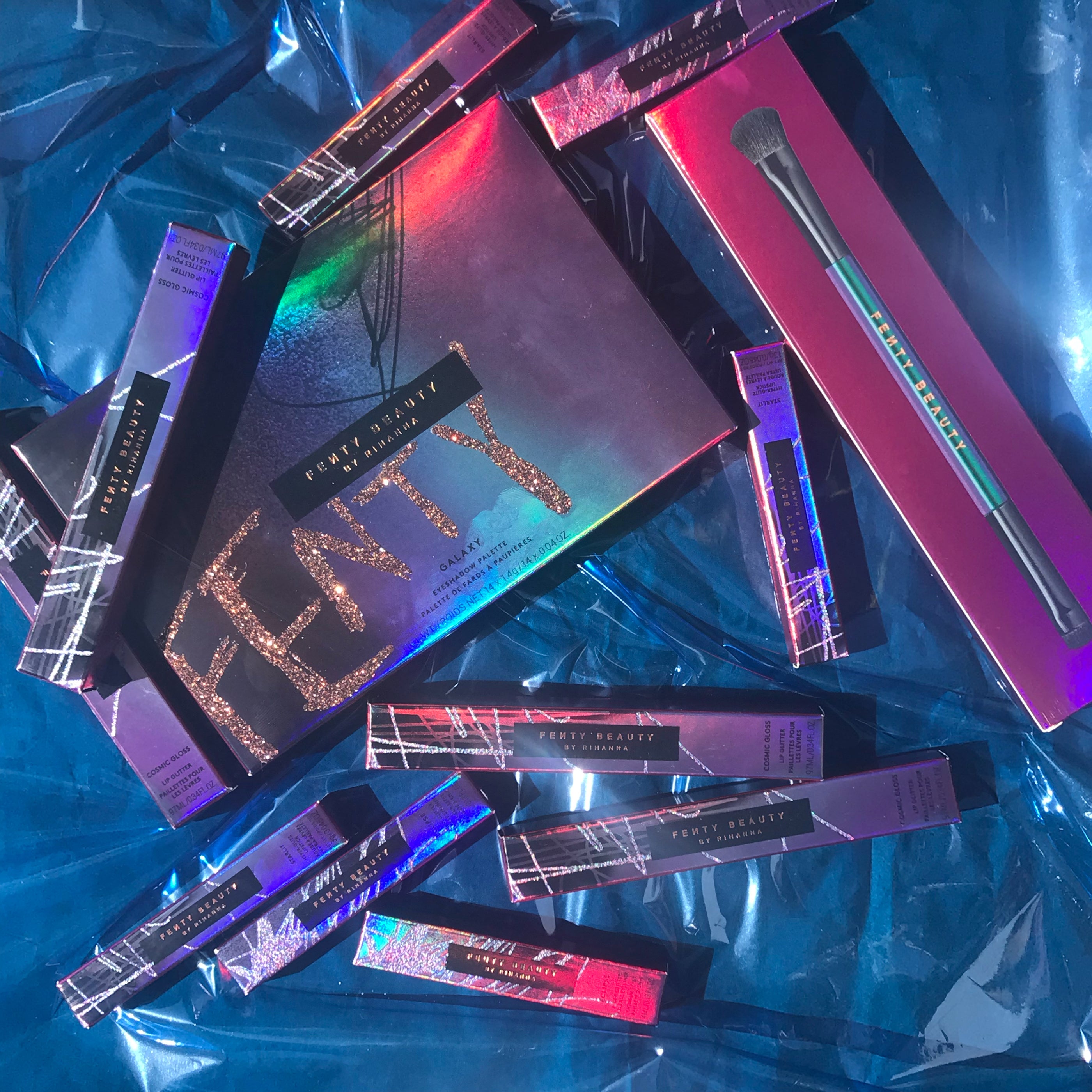
Rhianna’s Fenty Beauty Galaxy Collection is packaged in rainbow holographic packaging. You will find holographic designs frequently used in the beauty industry. The exclusivity and luxurious nature of the flashy colors pair well with the intent of the cosmetics using the color. Rhianna's' Galaxy collection emphasizes glittery, celestial-inspired colors for their products. The holographic design of the packaging matches well with this theme.
Another newer smaller brand making good use of holographic packaging is Supermoon Bakehouse. This is a small but well-known bakery in the Lower East Side of New York City. They make hand-rolled, hand-crafted, and locally sourced pastries. This small location has managed to draw in thousands of customers thanks impart to their Instagram friendly packaging and aesthetic. The store has simple grey stone walls, pink tables, and holographic boxes lining the walls. These care-packages offer a collection of different pastries. The boxes have a silver rainbow design that begs the customer to open it up and snap a picture. I'm sure the quality of the pastries also adds to their success, but the packaging cannot be overlooked.

|
 |
 |
Our Holographic

Our holographic bags are some of our most popular. Our first model of holographic sold out soon after it hit the market. In response, we added a variety of new models that expanded our variety. We now have StandStrong™ models with windows and without. We also have a new line of double-sided clear holographic bags that provide a new and unique style that you will have a hard time finding elsewhere on the market. We recommend these bags for the beauty industry because the awe-inspiring animated finish will make customers think of quality and luxury.
Our diamond holographic bags utilize the same sense of rarity that makes exclusive trading cards so appealing. Just as Supermoon Bakery uses holographic packaging to increase their social media appeal, so too will our holographic packaging bags. To see the full collection of holographic bags, check out our holographic page.
Final Thoughts
Hopefully, this blog has helped to expand your knowledge of the association behind bright and flashy colors. Some conclusions can be drawn from the three. First, bright colors like yellow and orange generate a warm sensation in the viewer that leads to connections with light, fire, life, and vitality. Second, bright colors are easier to see, which allows brands like McDonald's and Home Depot to stand out through billboards and advertisements. And third, bright and colorful packaging is an easy way to add a joyful and vibrant personality to your products. Why play it safe with monochromatic color schemes when you can make your brand come to life with bright colors?