The History of the Color Black and Black Packaging
What color are the words on the screen you are currently reading? Black. Black is and will forever be the most versatile color if you can even call it a color that we have in our box of paints. To begin to tackle the history of the color black and all that it represents is a rather large undertaking. In the beginning, there was darkness. Blackness. Rather than color, black is the absence of color, the absence of light. We fear the dark, the unknown that lurks inside the recesses of the back. And yet, we are also drawn to it. We move towards the dark void of mystery, the imp of the perverse nudging us to jump into the abyss and find out what's inside. There is undoubtedly a power held within the unknown inky mystery of black.
In the beginning, black held the crown because it was abundant and practical to use. As technology advanced, communication quickened, and colors got added, black held it's ground because of its versatility and simplicity. Today, the company that learns how to harness this black magic will pop out on the other side of the void unscathed, and with a forbidden knowledge that will propel them further. Let us begin the journey through the history of black.

The prevalence of black stems from the use of lampblack or soot. Every ancient civilization had access to soot, charcoal, or other burnt materials if they were also using fire. Each culture found different ways to create their black ink using combinations of soot, graphite, or charcoal, and a binding agent like and a binding agent such as gum arabic or animal glue, the prime ingredient in all of these recipes being carbon. Greco- Roman civilizations utilized sepia ink for writing, which comes from the ink sac of the common cuttlefish Sepia.

In the 12th century BC East Asia, we see records of mineral-based inks applied to canvases with brushes. Another interesting form of black ink found predominately in China is ink sticks. These were formed by burning pine or other carbon-rich materials like animal bones in a furnace. The furnace would spate the soot from the smoke of the fire. The soot would then be collected, with the soot at the farthest end of the long furnace treated as the most premium. The soot would then be combined with animal fat, egg whites, or fish skin and kneaded like dough. The sticks would then be shaped and left to dry for several years until they were ready to use.

In 1440, the printing press was invented by Johannes Gutenberg. His invention allowed for mass production of printed text and information to spread at previously unimaginable speeds. This invention is one of the most significant advancements in human history. The ink used for the process was, of course, black. What was unique about Gutenberg ink was that it was not ink at all. It was closer to a varnish or oil paint. A new ink was needed to work with the metal mechanisms of the press. The ink was composed of carbon, similar to the dye used in ink sticks and early dyes. Other ingredients include graphite, copper, lead, titanium, and Sulphur. The metal fragments included in the ink gave the printed text a distinct glittery appearance. The text created by this machine would reach millions of people. Millions of people would come to associate black Guttenberg ink as the standard for printed media.

Black was also the standard in other countries. We see early medicine advertisements from the Edo period in Japan, 1806 depicting hand-drawn samurais and text and a description of the product. Jumping ahead to one of the first instances of black logos on packaging, we have the Smith's Brothers Cough drops. In 1852 brothers William and Andrew Smith unveiled the first cough drops to the market. Their product was a quick hit, and soon generic forms of their products began popping up. To combat this, the brothers stamped their faces onto the packaging of their cough drops. The two brother's faces became one of the first widely known and circulated logos. Their faces were colored black, which contrasted against the red design of the packaging.
"There is undoubtedly a power held within the unknown inky mystery of black."

The very first advertisements got carved into stone and iron plates. Following the advent of papyrus and ink, we see the first use of black in advertisements. These were simple designs, words on paper that advertised the item sold. As advertising became more popularized and goods were sold further and further from the merchant, stamps, and early logos were needed. These could have been simple seals that had the name and location of the merchant, stamped on the storage crate. The color of these stamps? Black.

Jumping ahead to the twentieth century, faster and faster forms of communication enter the realm. Film, photography, and television remained in black and white for most of their early days. The technology to produce color media was more expensive and difficult to use compared to monochromatic film. Most televisions were black and white until the 1970s.
The television was invented in 1927, meaning almost half of the entire era of television was in black and white. This fact proves that early advertisements needed to stand out using only two colors. The very first television ad was for Bulova watches in 1941. It depicts America with a watch face at the center against a black background. In the days of television, black was the contrast. White shapes against black backgrounds or vice versa. All advertisements from 1941 to the late 1970s had to sell their merchandise using just black and white. We see Coca Cola ads from the 1950s, showing off the logo and bottles, but missing the red and white that makes the brand.

Similar to televisions, computers would not have color until the Apple II released in 1976. The very first computers had monochromatic screens with colored text. Today, many of the programs that are commonly used, including Microsoft Office or word, or any word processor, still use the classic white background and black text. Words and symbols are viewed in their base unaltered state as black. It is the standard for information. The moment children are introduced to the internet, they are given black text.

Packaging and Branding
As communication increased and information began to spread at rapid rates, businesses had to develop strategies to protect their content. Just as the Smith brothers placed their face on their packaging to ensure the authenticity of their cough drops, companies today need trademarks and branding to assure customers that their product is the real deal. From this need enters logos and branding, as you will learn, is tied with the color black.

Many logos and brand names are black. They are black is because when trademarking a logo, if you submit the claim in black and white, you can then also use it in different colors. If you submit your logo in a specific color scheme, every time you use it, it will have to be in the exact colors you submitted for trademark approval. For this reason, it is best to submit the logo in black or white to ensure future use.
"Words and symbols are viewed in their base unaltered state as black. It is the standard for information."
However, black packaging is not as popular as black logos. Why? There are a few possible reasons. Black is intimidating to some customers. It has a dark and sometimes Gothic appearance that could deter customers that are looking for more positive products. It may also be because black is more difficult to see when placed under overhead fluorescent lights. Black packaging may end up hiding in the shadows cast by the horde of other products. Still, some brands like TRESemmé, Axe, and the Spanish brand Maja are using mostly black packaging.
Black has a unique effect when used for either packaging or branding. Among the many brands with simple black logos, some stand out for their powerful use of the color. If we look at popular brands like Nike, Guinness, and Apple, we can see that what these brands have in common is iconic logos, and strong use of the color black. Each of these companies befits from our preconceived notions of what black is, what the color means, and the effect it has on the viewer.

We can begin with the simplest of the logos. The Nike check is widespread and easily recognizable. It is a simple checkmark, or swoosh as they refer to it, but the devil is in the details when it comes to logo design. If you trace the history of the company, the swooshed has been with them since they originally switched from Blue Ribbon Sports to Nike. The logo was designed by Carolyn Davidson around 1971, and today is worth around $26 billion. The swoosh logo has historically also incorporated the name Nike, but recently the solid swoosh has overtaken. The idea behind the logo was to incorporate motion to match the active apparel of the company.

Looking at the colors of Nike, they have historically incorporated reds and oranges to communicate passion and energy. But today, and for a chunk of time in the past, Nike has stuck with a solid black swoosh. The reason for this? Versatility. A black swoosh will stand out and match with most colors of shoes, shirts, or apparel. As we will discuss later, it also projects an exclusive and higher quality personality compared to brighter, flashier colors.

Guinness: For this dark-colored stout, incorporating black into the packaging is a story of embracing who you are. For as long as the beer has been put into cans, the packaging has reflected the dark and seductive tones of the drink. Early advertisements incorporated bright red text to capture the attention of the viewer. Today, we see many more golds and blacks in their marketing. They are still standing out but in a different way.
Consider all the beer cans available on store shelves. How many of them are black? Very few. The raining stars of the beer world all have their color. Bud Light has blue, Heineken has green, and Corona has yellow. The beer section of stores has a rainbow of different colors screaming for your attention. Amidst this spew of color, Guinness sits subtlety in the corner, the black finish and gold harp passive-aggressively letting you know that it's not like the other beers. Where the other brands shout, Guinness whispers a soft siren song, tempting you into its rocky shores.

Now let's talk about the star of the show. The brand currently has its tentacles wrapped around the world. Apple is arguably the most successful users of black logos, and as the other two mentioned, they are doing it so well it doesn't even seem like they are trying. A simple apple with a bite taken out of it is currently worth $154.1 billion, which is nearly double the second most valuable brand, Google, valued at $82.5 billion. The logo was designed in 1977 by Rob Janoff. The original Apple logo depicted Isaac Newton underneath the apple-tree in which he allegedly gained the inspiration for his work on the law of gravity. The apple theme was kept but simplified to the logo we know today. The bite was added to make it recognizable as an apple.


Originally the logo was made with multicolored stripes to represent the full-color display of the Apple II computer. It was later turned into a monochromatic color scheme so that the newer models of computers and laptops had a more sophisticated appearance. Today, we see the logo in a variety of colors from grey, to white, to black. The black and white versions are the most recognizable. Apple has reached the point where they do not need colors to sell their brand. The apple logo is recognizable enough to where it can just be a silhouette, and customers will recognize it. However, the black of the logo still does add to the brand image. Sophistication, luxury, and modernity are elements tied to black. The sleek and simplified logo goes hand in hand with what customers love about apple products.


There have been numerous studies over the years that tested individual’s reactions to different colors. These methods for testing between all these tests have varied, but the results of all of them have been consistent. We will look at one particular study and the results from it as they relate to the color black. "The impact of color traits on corporate branding” by Wei-Lun Chang and Hsieh-Liang Lin describes the positive traits, negative traits, and reception of different colors. This study had a group of people who look at colored logos for an imaginary company. The test subjects were then asked to describe their view of that brand based just on the logo. What was found was that "the black brand reveals darkness, staidness, and mystery.” The mysterious allure of black can be seen in our association with things like leather jackets and black dresses. Consider Marlon Brando’s character from Wild Ones. The leather-clad bad boy became ingrained in our culture to epitomize the concept of cool.
Subjects viewed the black and white monochromatic colors as out of the ordinary. Some of the negative traits that paired with black were fear, anger, sadness, remorse, and an association with death. We can see the association with black and death in the tradition of wearing black to funerals. Consider also the depiction of death or the Grim Reaper, a seethe wielding skeleton in a flowing black cloak. In medieval medicine, being pensive, melancholy, and withdrawn was thought to be because of an excess of black bile in the body. The association of black and death dates back to at least the Roman Empire. The connection between black and morning exists in several cultures. In West Africa, it is associated with spiritual energy and maturity, as well as funeral rites and mourning. In China, both white and black are connected with mourning.
Among the demographics tested, male office workers showed the most positive reaction to the black logos. Other results from this study show that black was associated with reliability, intelligence, and an upper-class personality. Consider the image of Don Draper from Mad Men, a professional man in a black suit and tie, confidently smoking and drinking in his top story office. Black in clothing can be used to achieve a timeless class in the case of office workers. The professionalism and charm connected to black reveal why tech companies like Apple are using it. Black checks all the boxes for their brand identity. However, it is not just tech companies that the test participants associated with the black logo. According to the researchers, “Some participants consider black and white to represent professional and specialized products, especially for cosmetics.” Channel and Dior have utilized black logos and dark colors in their advertisements before, aware of the reputation of the color.
The conclusion we can draw from the study is that black is a kind of double-edged sword when it comes to branding. It adds a touch of danger and mystery to your products. It can also convey steadiness and reliability. These qualities are contradictory. However, we can chalk that up to the method in which the color is used. What is the same between both perspectives is that black is out of the ordinary. It can be a sign of quiet confidence, originality, or aggressive edginess. These are all different black suits in which you can put your products.
Our Blacks
Black is so versatile because there are so many different kinds of black. Try wearing three different black clothing items. Each will be a different kind of black. At QQ Studio, we try to tackle the many, many different styles of black that exist in the world. Here is a breakdown of our different blacks:

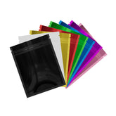
Our waxed-black bags capture the feeling of an elegant black candle. The matte finish has a low shine and a soft texture that whispers luxury. Like a new car or freshly ironed shirt, the waxed-black bags have bold confidence that cannot be beaten. Companies like Guinness and TRESemmé utilize a matte black look to capture a sophisticated and mature appearance. We drew on inspiration from these companies when we created our collection of matte black packaging bags. When you tap into this style, your products will have the same elegant class that is leading to the success of the mentioned brands.

For a bolder and louder take on black, consider our mirror-black collection. These high shine glossy black bags reflect light at the viewer to force them to turn and look. Rather than hide in the shadows, the mirror black bags stand in the spotlight. Brands like Apple utilize a shiny black aesthetic to project a modern presentation, quality, and reliability. Other brands like Nike, Burberry, Channel, and Dior, use a glossy black because it is luxurious and cool. Our mirror-black collection draws on power from this concept to add a glamourous edge to your products.
Fade to Black
The history of the color black is as deep as the ever-expanding void of outer space. It is impossible to determine who was the first human being top utilize the dark power of the color black. What we do know is that black will never fade or vanish from use. Black is capable of changing the entire personality and view of a company. When brands tap into the well of power that black contains, they alter the entire view of their company. No other color has this kind of gravity. Nothing will truly ever be the new black, because no color stands up to its power.


